
Brand Definition
Clarified tone, typography, and visual rules to support a “bold litigation” positioning.
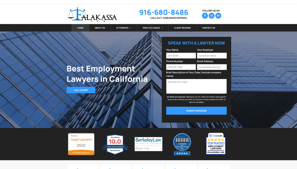
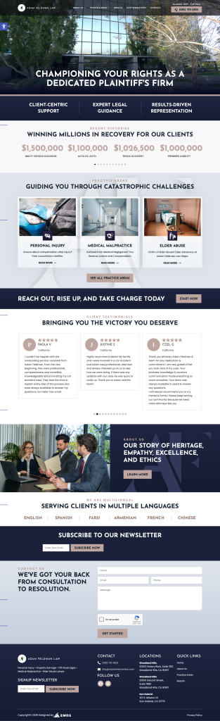
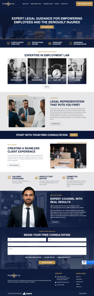
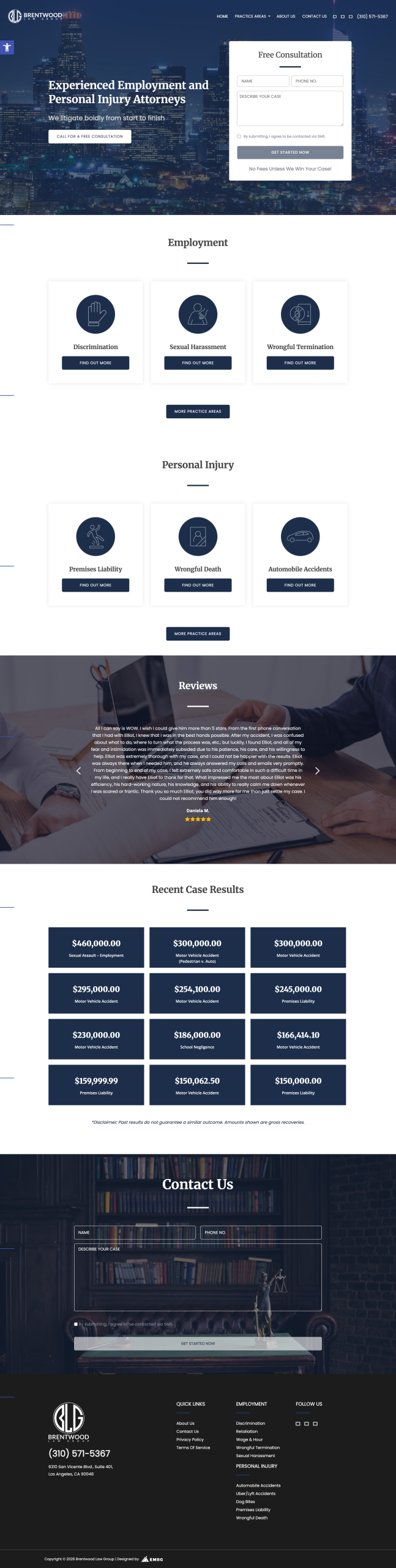
Brentwood Law Group
The firm needed a modern, conversion-forward site that clearly separates two core practice lines while maintaining a single, cohesive brand voice and a frictionless consultation flow.
The Challenge
The challenge was balancing two complex legal categories—employment and personal injury—without forcing users into long reading. Visitors needed to find their issue fast (e.g., discrimination, wage & hour, wrongful termination, or accident injuries), understand the firm’s positioning, and feel comfortable starting a consultation.
“Clarify a dual-practice firm in seconds—then convert with a simple, confident consultation journey.”
Our Approach
We built a practice-area-first structure with strong above-the-fold CTAs and brand language that reinforces bold advocacy, then packaged social-ready brand elements to keep the firm consistent across channels.
Clarified tone, typography, and visual rules to support a “bold litigation” positioning.
Designed a clear split between employment and PI with predictable navigation and page templates.
Implemented consultation CTAs and form flows aligned to high-intent visitor behavior.
Tested mobile-first performance, accessibility basics, and contact reliability across templates.
The Results
Visual Breakdown
““He helped me get my case settled in less than two months!””